BACKGROUND
Instashop is an online grocery shopping product that offers an on-demand, convenient way to shop for ingredients needed in your kitchen. With a huge new market for prepared meals and delivery services such as Uber Eats, Instacart and Postmates, it is important to research how consumers shop online and interact with Mobile shopping platforms.
GOALS
Build empathy with customers by identifying the target market for Instashop and understanding consumer behavior for online shopping.
PHASE ONE
EMPATHY RESEARCH
METHODOLOGY
The methodology of using interviews, surveys and competitive analysis were chosen to begin design research.
The participants consisted of college students, people with disabilities, senior citizens, and busy full-time working individuals that were single or had a family.
Through conducting 1:1 interviews, 4 participants were interviewed to describe an online shopping experience and a memorable grocery shopping experience.
RESULTS
The research found that the 2 younger participants had shopped online quite a bit but the 2 older participants had not. This was interesting to me because their daily lives were just as busy, so what was holding them back from trying to shop online for groceries?
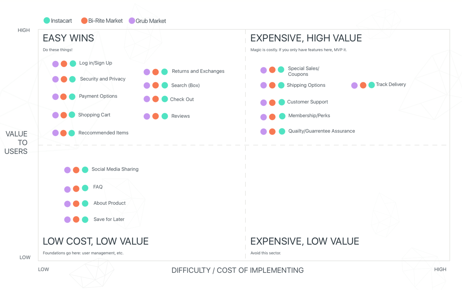
After the interviews I did some further digging comparing three popular online shopping platforms in the San Francisco Bay Area; Instacart, GrubHub, and Bi-Rite Market.
Below is a competitive analysis feature matrix comparing the three businesses.
COMPETITIVE ANALYSIS
PHASE TWO
DEFINE AND IDEATE
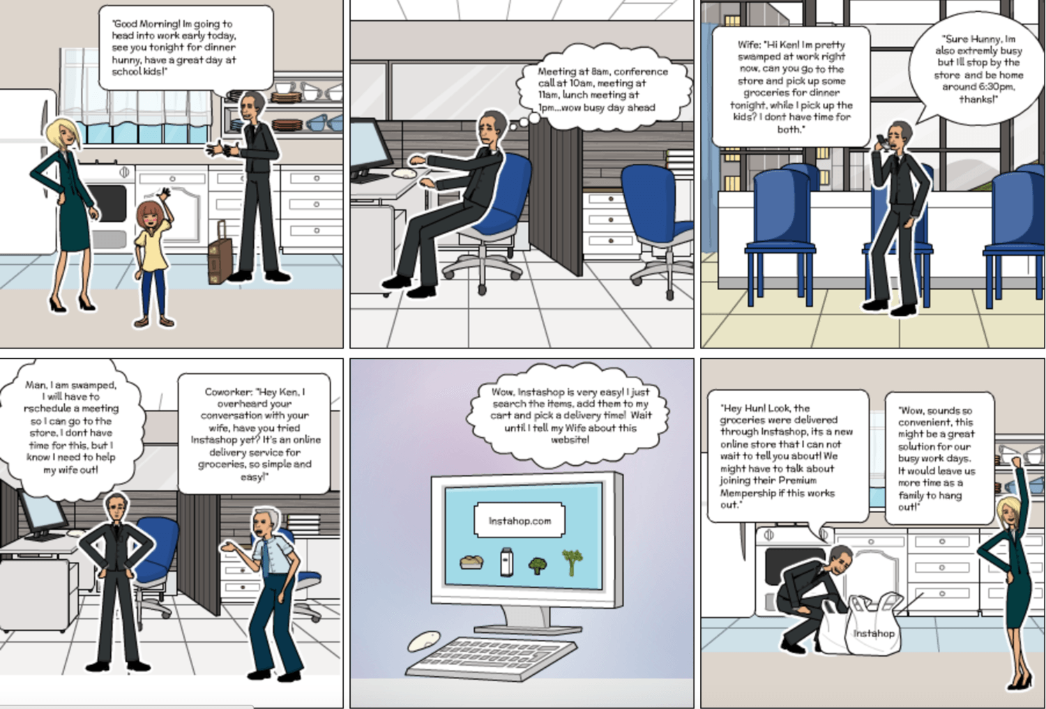
STORYBOARD
I created a storyboard with Pixton to best describe a new user of Instashop discovering the product. It shows a family with two full-time parents that work long hours and do not have time to grocery shop. They discover Instashop and use it for a convenient grocery delivery experience.
PERSONA
Moving into the Define Stage of designing, a persona was starting to develop. After the interview findings were analyzed, I wanted to focus on an older, working generation due to the behavioral need to learn the convenience of shopping online.
Ken Goodman is a full time working dad, divorced with 2 kids. Ken finds it hard to find time to go shopping before the kids are in town. He wants to maintain this busy work schedule, but be a great dad for his kids, without having to take time to go grocery shopping. Instashop can help save Ken time and still impress his kids.
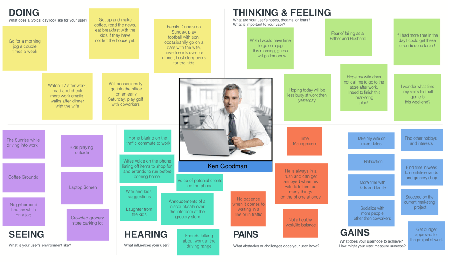
EMPATHY MAP
Ken Goodman's persona was further developed with an Empathy Map. This described Ken’s thoughts, goals, habits, frustrations and influences in everyday life.
CARD SORTING
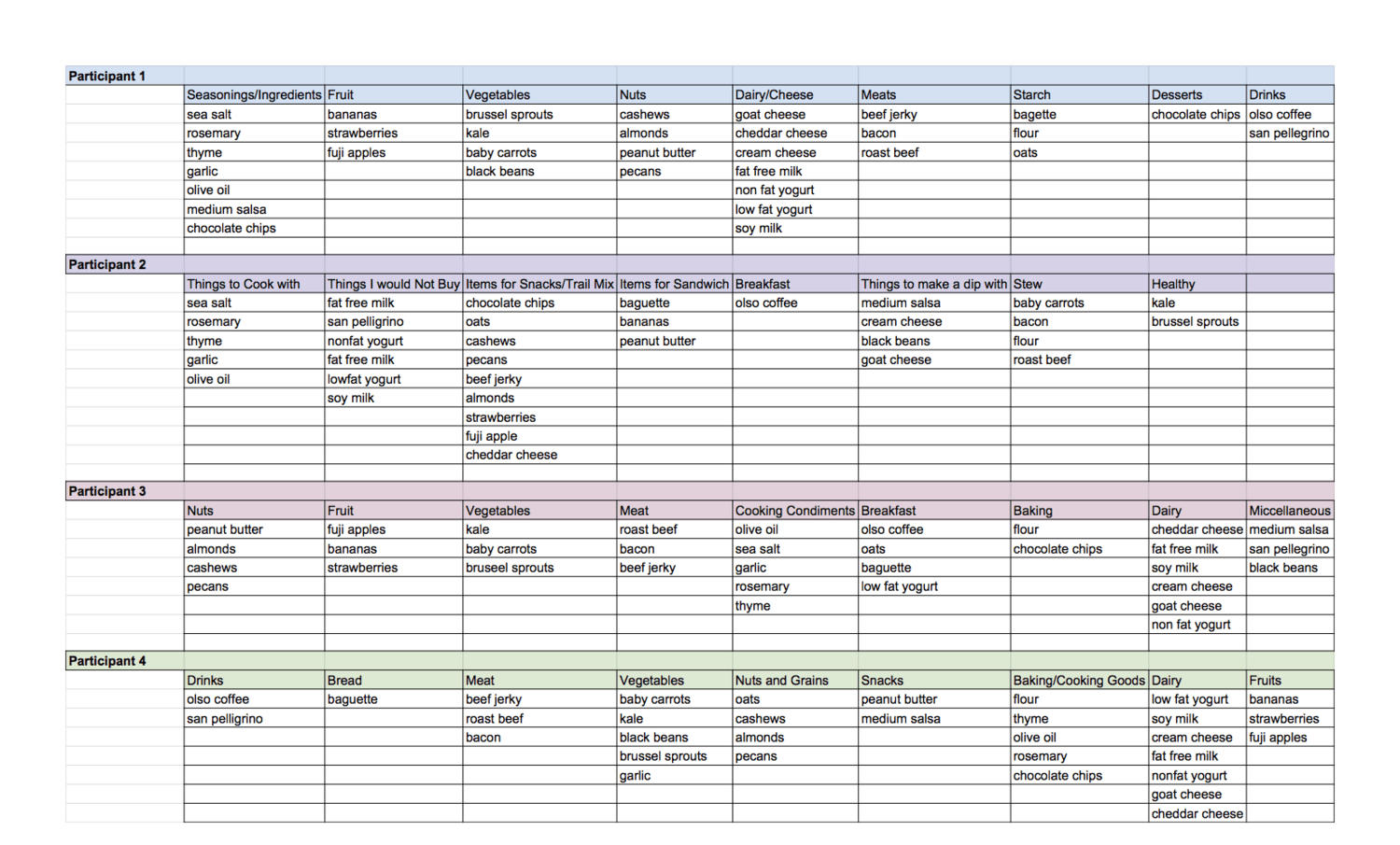
To evaluate the information architecture of Instashop, I had 4 participants organize grocery store products into categories that made sense to them. For example, the milk and yogurt could be placed in a Dairy category. This helped to figure out the structure of categories that the user would use to navigate on the homepage.
SITEMAP
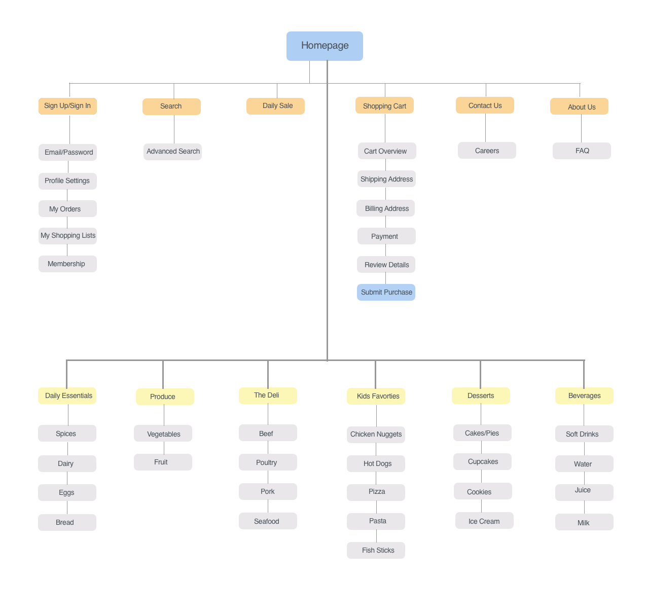
I created a site map to represent the content of Instashop. It shows how people navigate around the site and provides a view of the entire structure of the shop.
USER FLOW
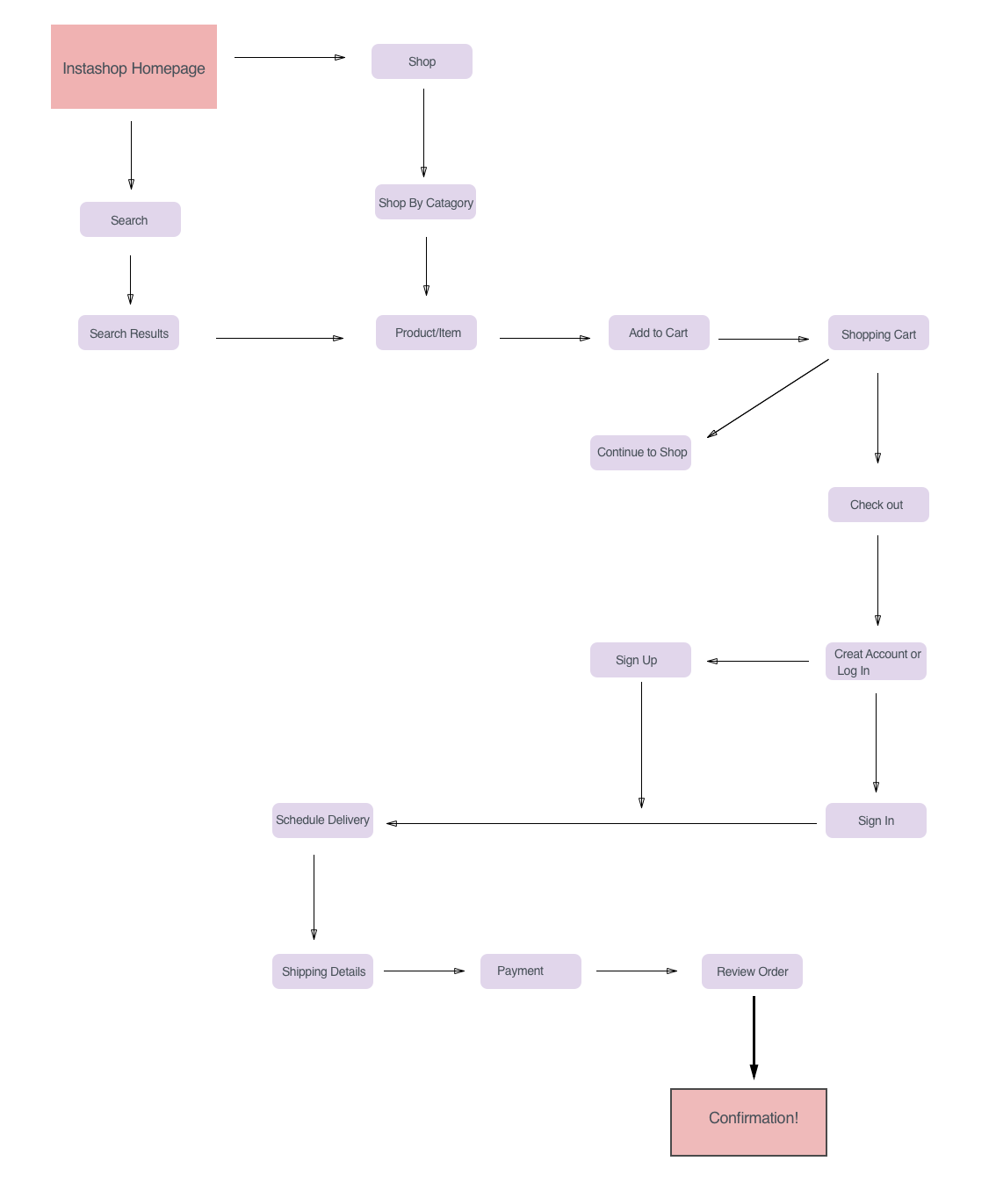
The Ideate Stage led to the development of the Instashop user flow. This helps visualize how users move through the product to accomplish their goals. This user flow shows a specific path a user could take and also highlights critical decision points.
This user flow displayed the different primary screens that needed to be made into wireframes. For example, the Homepage would eventually lead to the confirmation screen.
PHASE THREE
INTERACTION DESIGN
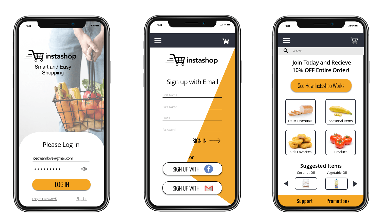
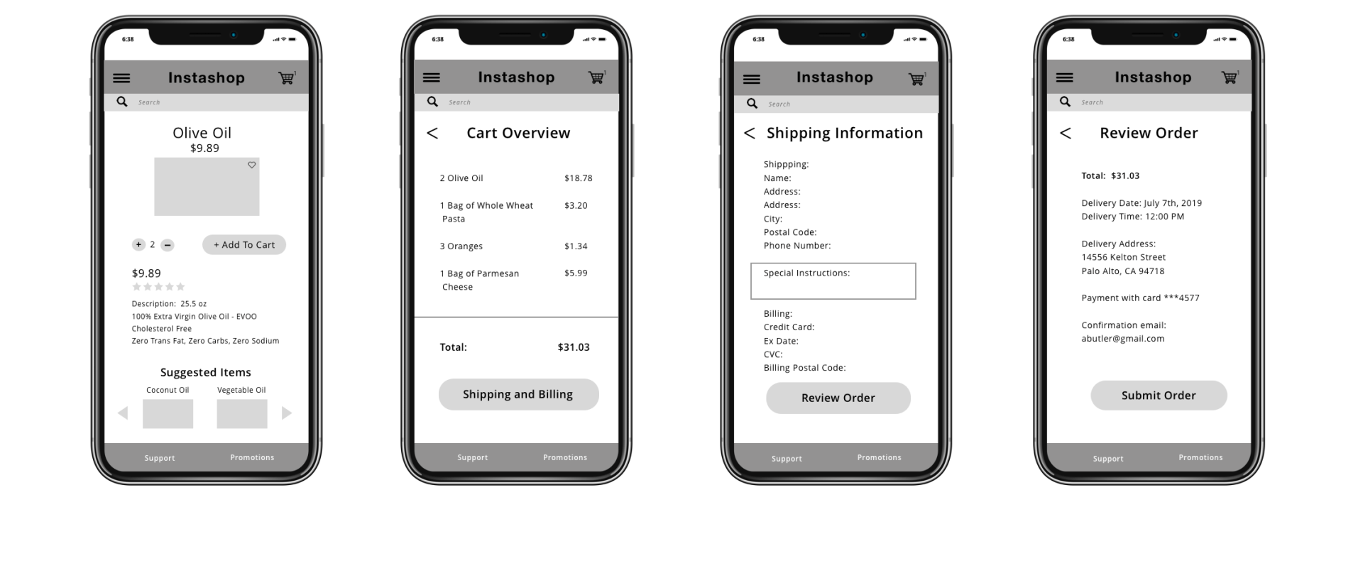
A list of requirements were established before the building of wireframes began. It listed the user tasks that were most important to the features of Instashop, the requirement of this particular page, and how the design could achieve these requirements.
The Sign up page, Homepage, Add to Cart, and Checkout process were all chosen as Instashop's top requirements.
WIREFRAMES - MOBILE
PHASE FOUR
TESTING
After the Wireframes were developed, a Prototype was made in the Invision App.
Testing the prototype was done with 4 participants between the ages of 25-65. They were allotted 4 tasks to complete.
An Example of one tasks was: Please find the sign up button and sign into Instashop using your email address.
Additional Testing with programs like Usability Hub and Verify was unmonitored. I used these usability tests for focusing on a specific areas of the design flow, like the checkout page, product page or the sign up process.
Example of Protoype test in Invision App
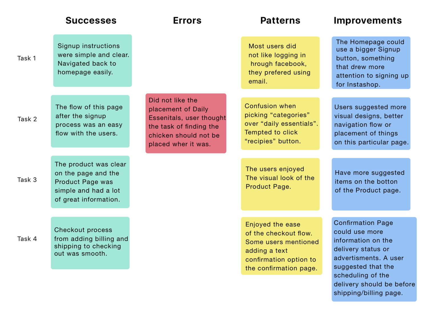
The Affinity Map was a clean way to organize the results from the Usability Tests. It was helpful to know what the successes, errors, patterns and improvements were that the users were able to identify.
AFFINITY MAP
RESULTS FROM TESTING
Takeaways:
- I wanted to focus on an older user demographic for Instashop, and what I noticed is that the older users became frustrated or felt confused while online-shopping.
- All four participants using the Invision App were able to give feedback about the visual design structure of my wireframes. This led me to restructuring part of the flow of the homepage after the signup process is complete.
PHASE FIVE
VISUAL DESIGN
LOGO
STYLE TILE
FINAL DESIGN OF MOBILE
CONCLUSION
At the end of the process, I did find out that my persona was not the best match for a typical customer of Instashop. With testing the wireframes and prototype on individuals around Ken Goodman's age, I found that they were not interested in a lot of the features the product offered and preferred in store shopping to online shopping. What I have found to be the most challenging part based on my research is that people have different definitions of online grocery shopping, and it can be challenging to design for everyone's needs.
