AMMA
Mobile Design
BACKGROUND
AMMA stands for Asthma Monitoring and Management Application, a companion app to Google.org’s healthcare wearable device. The aim of this app was to design a user experience that helps those who suffer with asthma feel more in control of their condition, by managing and monitoring their day-to-day symptoms.
PROBLEM
Asthma affects more than 25 million people in the US alone, is responsible for 14.2 million physician visits each year, and 1.8 million emergency care visits. It is clear there needs to be an easier way for patients and individuals suffering from asthma to monitor their symptoms.
SOLUTION
Create an easy and non-intrusive way of managing asthma in the form of a wearable that detects the user’s breathing patterns, other health vitals and inform the user when their attention is needed through a companion mobile app.
GOALS
The goal was to design a superior user experience for Google.org’s new healthcare product line. Provide strategic and human-centered design direction to ensure the technology would serve their customer needs.
PHASE ONE
RESEARCH GATHERINGS
The main goal for the in-person interviews was to understand how people currently deal with asthma, what they use to control it, and to define all the problems and difficulties they have in this process. I found four participants that have various levels of asthma. After the interviews I was able to gain some insight into the daily struggles that these people were experiencing. This was crucial for me since I didn't have a great understanding of asthma. Being able to empathize with the participants was what would enable me to create a great user experience.
RESULTS
- 75% were Male and 25% were Female
- The age range of all four participants was 24 to 45
- 100% of participants have mild asthma and 75% of them have had this condition since childhood
- 100% of participants have a rescue inhaler for treating asthma and all of them keep it with them to use irregularly
- 75% of participants said that the asthma flares up when they exercise
- 75% have never used technology tools to control their asthma
A Competitive Analysis of three applications for Asthma management; AsthmaMD, Medtep Asthma and Propeller, revealed that there was unexplored potential in this market. Only Medtep Asthma offered detailed information about air pollution to the user, but none of the applications included a wearable device that could track a cardio system condition, sleep quality, and breathe indicators.
PHASE TWO
UX STRATEGY BLUEPRINT
With my primary and secondary research, I crafted a strategy blueprint.
Challenges:
- Price is a little high ($299) and additional medical alert service fees, could discourage asthmatics from purchasing it.
- Asthmatics may not want to wear the device at all times
- Encouraging users to log in their asthma symptoms and peak flow
Aspirations:
- Create an app to help prevent and provide insights into asthma symptoms and general education about asthma to be learned by user.
- Allow users to feel secure throughout their daily activities.
- Help reduce future asthma inflammation and attacks.
Focus Areas:
- User must input the following; action plan, treatment plan, medicine, physician’s contact information, and caretakers information.
- User will log inhaler usage daily. (pop-up, notifications)
- Option on the login screen to use as child mode, when the wearable is worn by someone young enough to have a caregiver.
Guiding Principles:
- App must be simple and intuitive enough for someone without technology or a medical background to gain value from.
- Approachable for all ages.
- App is designed to be personable and supportive
- Easy flow from wearable technology to the companion app
Activities:
- User research of 4 individuals with Asthma
- Competitive analysis of 3 companies in the market today
- Wireframe development: highlighting key features to help guide the users around the app.
- Testing and prototyping: receive ongoing feedback to ensure the application and its features are continuing to provide relevant and helpful service.
Measurements:
- After a designated amount of time using the wearable, the user will have a decrease in the amount of asthma attacks.
- Number of purchases of asthma technology and amount of application downloads, high frequency of use.
- Testimonials from users who have witnessed improvement of monitoring their asthma and lowering the number of asthma attacks.
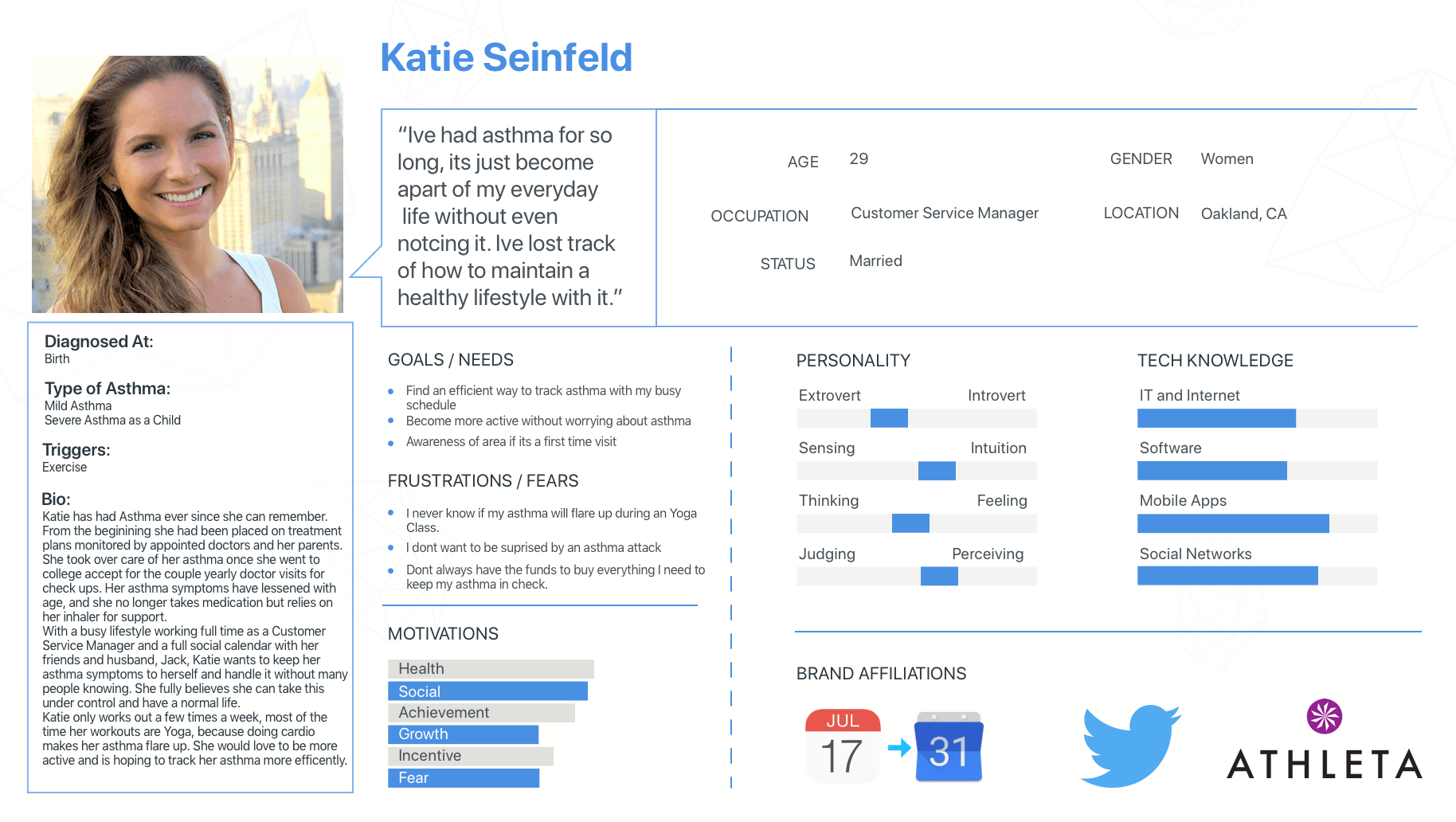
PROVISIONAL PERSONA
To understand the target audience better and make the design process more human-centered, I created a fictional user named Katie Seinfeld based on the information I received in the research phase. She has mild asthma that is triggered by exercise and wants to find a way to monitor it so she is able to enjoy a workout.
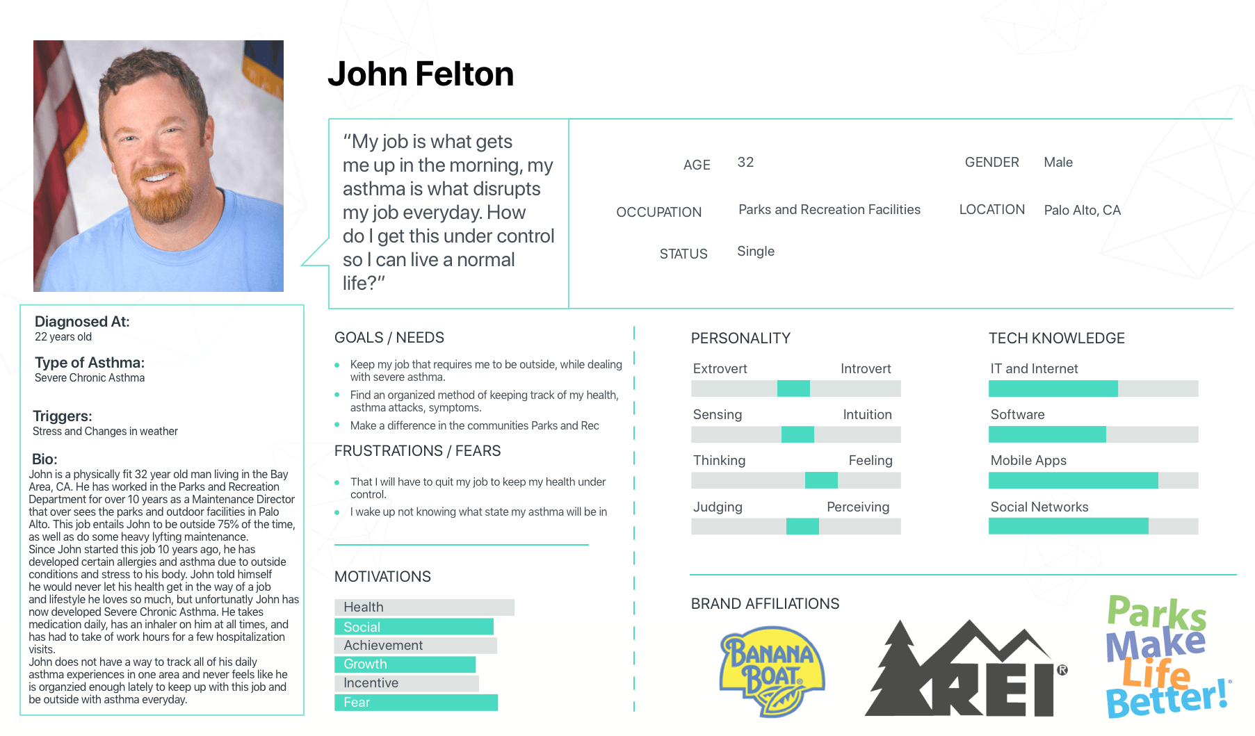
After making this persona, I realized that I wanted to show a second user that displayed severe asthma, and thats where John Felton came in.
John Struggles with severe Asthma and was diagnosed at the age of 22. He works outside so it is difficult for John to predict the weather, because that is what causes his Asthma to flare up the most. John has had to leave work multiple times to go to the hospital. He needs a more convenient way to monitor his symptoms and help create action plans for his health.
Create an easy and non-intrusive way of managing asthma in the form of a wearable that detects the user’s breathing patterns, other health vitals and inform the user when their attention is needed through a companion mobile app.
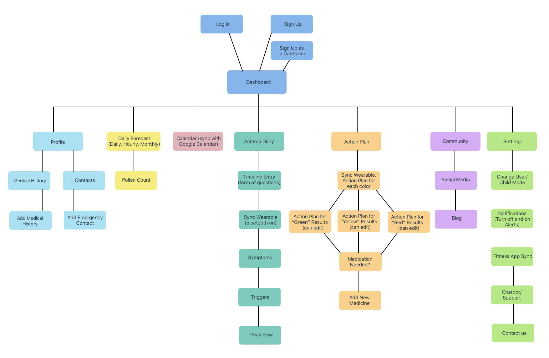
SITEMAP
The main point of the general structure in the sitemap was to make the maximum amount of elements visible and accessible in one step, so the user could check their health conditions efficiently.
PHASE THREE
INTERACTION DESIGN
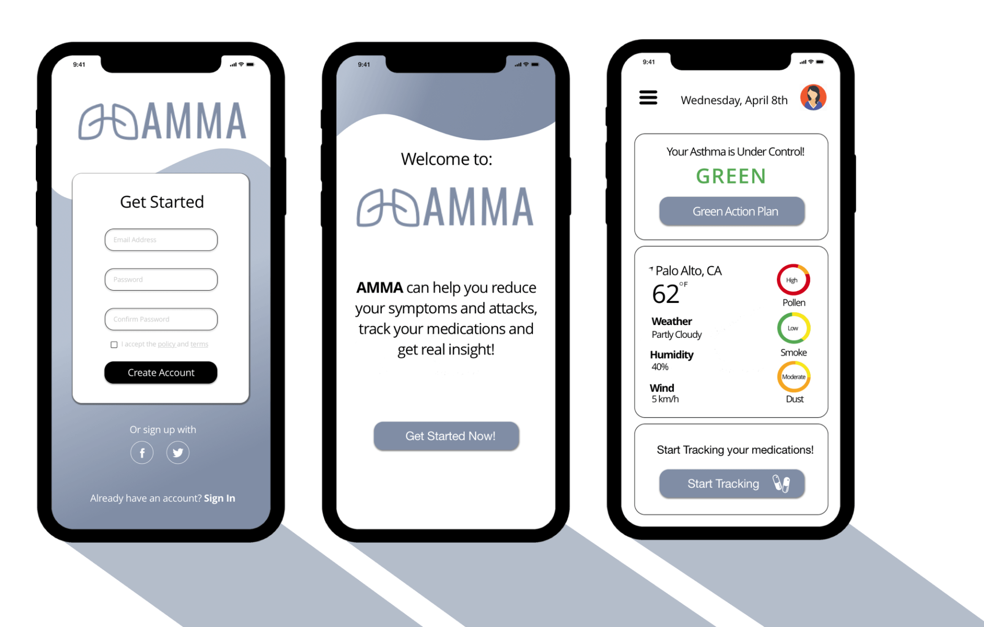
WIREFRAMES
Click for annotations
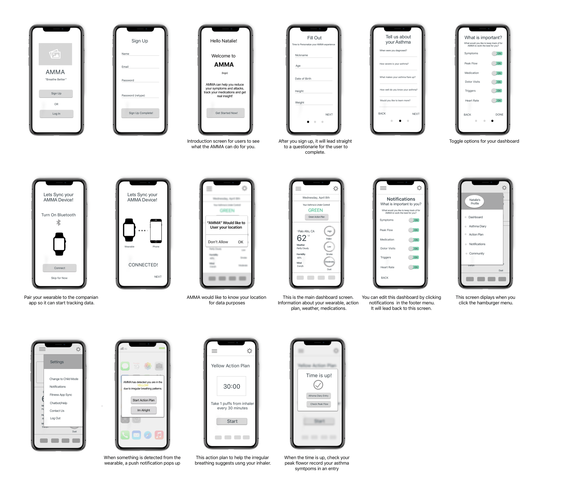
PROTOTYPE
TESTING AND RESULTS
With these wireframes prototyped in Marvel, I conducted in-person prototype interviews and remote usability testing. Here are the results;
Success:
Participants were able to easily go through the directional process of each screen. Participants thought the layout was nice for the dashboard with the action plan and weather visibility.
Fail:
Participants had a hard time understanding the "What is important to you" screen. They thought this could be customized later on and not displayed in the beginning.
Improvements:
Lots of spelling errors/grammatical errors were caught. On the "Tell Us about your asthma" screen, one participant thought that the questions could be worded to make users feel more comfortable (Ex: Change, How long have you had asthma, to; When were you diagnosed with asthma?). For the "What is Important to you" screen, change the word exercise to heart rate, it relates to asthma and the medical field more specifically.
- It makes too many assumptions about what the user would want to see on their dashboard thereby creating a cognitive load for the user.
- This dashboard requires the user to open the app and check the dashboard to see inhaler and weather information, instead of delivering the information when it would be most beneficial for them.
My goals moving forward:
- The dashboard needs a clear direction and focus.
- It needs to make less assumptions and be more distinctly direct to the user, creating a more personal experience.
- For weather patterns that affect their asthma and inhaler location/medication level, enable user to set up alerts for information that is specifically important to them. This way they can receive information at the exact time they would need it.
KEY SCREENS

CONCLUSION
In this very practical application of lean UX towards a product design project, I learned a great deal about creating a user experience that affects the user beyond the interface--the screen. I learned that categorizing users into personas should be done with care: making unhelpful distinctions and forgetting what the user really wants is too easy to do.
What I would have done differently (with more time):
I think the biggest sacrifice I made for time was lack of testing. There are probably several pain points within my app that I can't detect without user input. These participants wouldn't even necessarily need to be asthma sufferers (though it would be nice).